
Open any Shopify store’s PageSpeed report and the same finding sits at the top of the list: images. Not apps, not Liquid, not the theme framework. Images. They are the heaviest asset class on almost every storefront we audit, they are the Largest Contentful Paint element on the vast majority of pages, and they are the single fastest thing to fix when a client asks us why their store feels slow on a phone.
The frustrating part is that Shopify already ships a world-class image pipeline. The CDN converts formats automatically, resizes on the fly, and caches at the edge. Most stores are slow not because the platform is limited but because the theme asks the CDN for the wrong thing: full-width master images on mobile, lazy-loaded heroes, srcset attributes copied from a template that does not match the actual layout grid.
This is the image optimization playbook we run on every Insiteful build and every performance retainer. It is all native Shopify, no headless rebuild, and most of it is measurable within a week of shipping.
Images Decide Your LCP, and Your LCP Decides Revenue
Start with the evidence, because the numbers here are not subtle.
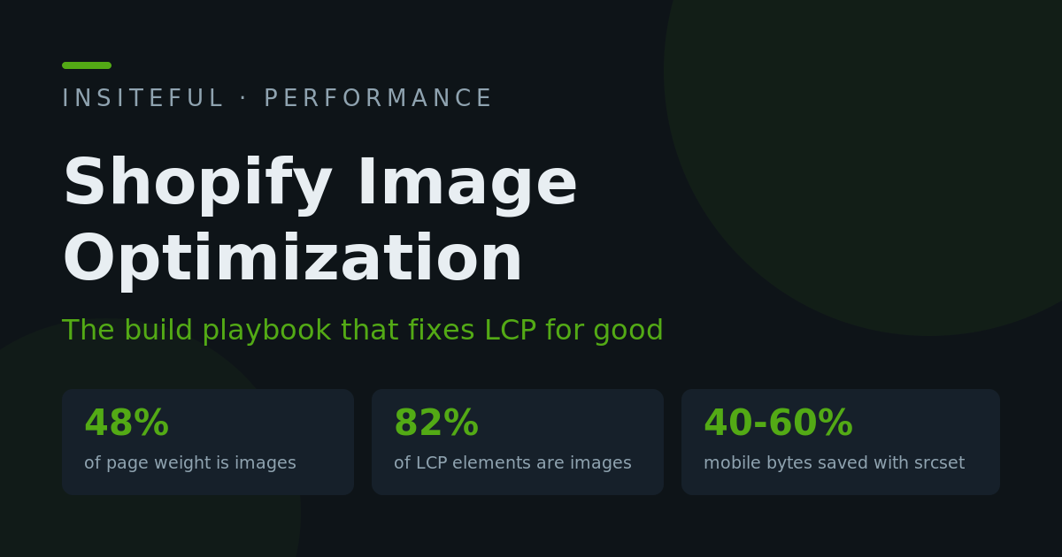
The HTTP Archive Web Almanac puts images at roughly 48 percent of total page weight on the median site, and its performance data shows an image is the LCP element on around 82 percent of desktop pages and 72 percent of mobile pages. For ecommerce those numbers skew even higher, because product and lifestyle photography is the product presentation. If your LCP is failing, the odds say an image is the reason.
The revenue link is just as well documented. Google and Deloitte’s Milliseconds Make Millions study measured a 0.1 second mobile speed improvement and found retail conversions rose 8.4 percent, with average order value up 9.2 percent. Rakuten 24’s Core Web Vitals case study is even sharper: hitting the good LCP threshold produced a 53.4 percent increase in revenue per visitor and a 33.1 percent lift in conversion rate against the control.
Put that in local terms. A store doing $3.2M AUD a year with 65 percent of sessions on mobile is leaving somewhere in the low six figures AUD on the table if its mobile LCP sits at 4 seconds instead of under the 2.5 second threshold Google’s CrUX data grades as good. We have watched that maths play out on client stores often enough that we now treat image work as the first sprint of any performance engagement, ahead of app rationalisation and script deferral. Our app audit case study covers the app side; this article covers the image side.
What Shopify’s CDN Already Does (And Where It Stops)
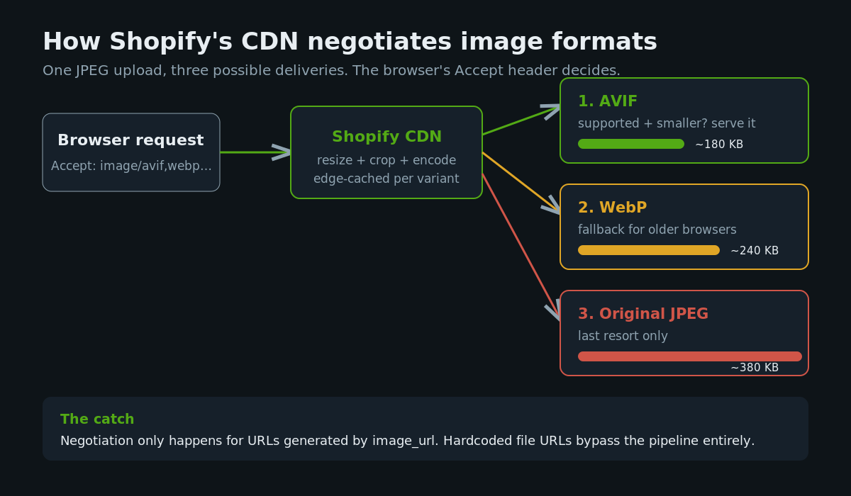
Every image you upload to Shopify is served from its CDN, and since the platform enabled automatic AVIF delivery, the format negotiation happens without you touching anything. The CDN inspects the browser’s Accept header and works down a priority list: AVIF if the browser supports it and the AVIF encode is smaller, then WebP, then the original JPEG or PNG you uploaded.
That matters because the compression gains are large. Google’s own WebP study measured WebP files 25 to 34 percent smaller than equivalent-quality JPEGs, and AVIF typically lands another 20 to 30 percent below WebP on photographic content. A 380 KB product JPEG becomes roughly 240 KB as WebP and under 180 KB as AVIF, with no visible quality difference on a retina phone screen.
So the format problem is solved. You do not need a format conversion app, and you should never upload WebP or AVIF source files yourself. Upload high-quality JPEG or PNG and let the pipeline negotiate.
Here is where the pipeline stops, and where builds go wrong. The CDN only optimises what it is asked for. Three failure modes account for nearly every slow Shopify storefront we open:
First, master URLs. Any image rendered without an explicit width parameter is served at its source dimensions. A 4500 pixel photography export served into a 400 pixel grid tile is a 10x oversupply that no format conversion can rescue.
Second, bypassing the pipeline. Images hardcoded into custom sections, page builder blocks, or metafield rich text with raw file URLs skip the transformation layer entirely. If the URL does not carry width and format parameters, the CDN serves the original bytes.
Third, wrong loading semantics. The CDN cannot fix a hero image that the browser discovers late because it is lazy-loaded, or a grid that jumps because no dimensions were reserved. Delivery is only half the job; the markup is the other half.
The image_url Filter, Done Properly
Everything flows through one Liquid filter. The difference between a fast and slow storefront is usually visible in how the theme calls it.
The lazy pattern we find in cheap theme customisations looks like this:
{% comment %} The slow way: one giant image for every device {% endcomment %}
<img src="{{ product.featured_image | image_url: width: 2048 }}" alt="{{ product.featured_image.alt }}">
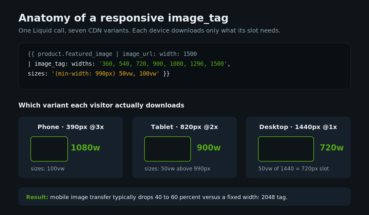
Every visitor downloads a 2048 pixel image, including the 60 to 70 percent on phones whose layout slot is 375 to 430 CSS pixels wide. At a device pixel ratio of 2 to 3, the correct request for those visitors is 800 to 1300 pixels, roughly a third of the bytes.
The correct pattern uses the image_tag filter, which generates a full responsive srcset from a single call:
{{ product.featured_image
  | image_url: width: 1500
  | image_tag:
      widths: '360, 540, 720, 900, 1080, 1296, 1500',
      sizes: '(min-width: 990px) 50vw, 100vw',
      alt: product.featured_image.alt | escape
}}
That single tag emits an img element with seven CDN variants in its srcset, and the browser picks the smallest one that satisfies the layout slot and the device’s pixel density. On the stores where we have replaced fixed-width tags with tuned image_tag calls, mobile image transfer typically drops 40 to 60 percent with zero visual change.
Two implementation notes from production. The widths list should stop at the largest size the layout can actually render; shipping a 2048 or 2880 variant for a slot that maxes out at 700 CSS pixels just gives high-DPR desktops permission to waste bandwidth. And every image_url call should carry an explicit width, even in email templates and metafield renderings, because a bare image_url falls back to a small default that then gets upscaled and looks soft.
Preload the Hero: LCP Image Rules We Apply on Every Build
Your LCP element on most templates is the hero banner on the homepage and the featured product image on the PDP. It gets special treatment, and the rules are strict because getting any of them wrong costs 300 to 800 milliseconds of LCP.
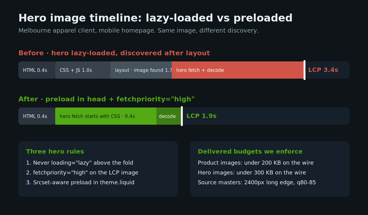
Rule one: never lazy-load it. loading=”lazy” on an above-the-fold image tells the browser to deprioritise the one resource that defines your LCP. It is the most common single-attribute performance bug on Shopify themes, usually introduced by a blanket lazy-load app or a find-and-replace during a template edit.
Rule two: mark it high priority. fetchpriority=”high” moves the hero to the front of the browser’s request queue, ahead of the CSS-discovered and below-the-fold images competing for bandwidth.
Rule three: preload it from the document head when the template knows what it is. On section-built homepages the hero image is set in the section settings, which means theme.liquid can announce it before the parser ever reaches the section markup:
{% if template == 'index' %}
  <link rel="preload" as="image"
    href="{{ section_hero_image | image_url: width: 1080 }}"
    imagesrcset="{{ section_hero_image | image_url: width: 720 }} 720w,
                 {{ section_hero_image | image_url: width: 1080 }} 1080w,
                 {{ section_hero_image | image_url: width: 1500 }} 1500w"
    imagesizes="100vw"
    fetchpriority="high">
{% endif %}
The imagesrcset attribute matters: preloading a single fixed URL forces the same bytes on every device, while a srcset-aware preload lets the phone fetch the phone-sized hero early. When we shipped exactly this pattern for a Melbourne apparel client last quarter, mobile LCP on the homepage moved from 3.4 seconds to 1.9 seconds in CrUX within the 28 day collection window, with the preload contributing roughly half the gain.
This work compounds with interaction tuning; if your team is chasing responsiveness scores too, our INP build playbook covers that half of the equation.
srcset and sizes That Match Your Theme Grid
The srcset attribute gets the attention, but sizes is where themes quietly lie to the browser. srcset lists what variants exist; sizes tells the browser how large the slot will render before CSS has loaded. When sizes is wrong, the browser downloads the wrong variant with complete confidence.
The default we see everywhere is sizes=”100vw” on every image, copied from a hero component into grid tiles. On a four-column desktop collection grid, each tile occupies roughly 25vw, so 100vw makes every tile fetch an image four times wider than needed. Sixteen tiles at 4x the bytes is not a rounding error; on a typical collection page it is more than a megabyte of waste.
We write sizes by reading the actual CSS. For a standard collection grid that runs two columns on mobile and four on desktop inside a 1400 pixel max-width container:
sizes="(min-width: 1400px) 330px,
       (min-width: 750px) calc((100vw - 10rem) / 4),
       calc((100vw - 3rem) / 2)"
Fixed pixel values at the wide end, viewport calculations below, matching the grid’s gap and padding maths. It is tedious the first time and then it is a pattern your team reuses on every section. The payoff shows up directly in transferred bytes: the browser stops guessing and starts fetching the 360 pixel variant for a 330 pixel slot.
One more grid discipline: crop consistency. Mixed portrait and landscape uploads force either layout shift or awkward object-fit cropping at render time. We standardise the crop in the pipeline instead, using image_url’s crop parameters so every tile arrives at the same aspect ratio, cropped around the subject rather than dead centre where the platform supports focal points. Uniform tiles also make the sizes maths honest, because every slot in the grid really is the same shape.
Below the Fold: Lazy Loading Without Layout Shift
Everything below the fold should lazy-load, and native loading=”lazy” is all you need. The JavaScript lazy-load libraries that themes bundled five years ago now add scripting cost to solve a problem the browser solves for free, and they hide images from the preload scanner, which slows discovery even when the logic works. Ripping them out is a standard line item in our theme surgery.
The catch with lazy loading is what it does to layout stability. An image that arrives late with no reserved space shoves the content below it, and enough of those shoves fails your CLS score. The fix is to always reserve the slot. Shopify’s image_tag emits width and height attributes automatically, and modern browsers derive the aspect ratio from them; for hand-written markup, set the CSS directly on the container:
.card__media {
  aspect-ratio: 3 / 4;
}
.card__media img {
  width: 100%;
  height: 100%;
  object-fit: cover;
}
The image can now arrive whenever it likes and nothing moves. On a recent audit for a homewares client, this one change on the collection grid took template CLS from 0.31 to 0.02, which moved the store’s mobile CLS assessment from failing to passing in a single deploy.
Two smaller below-the-fold rules we apply. Cap decode work on long grids with decoding=”async” so image decode never blocks the main thread during scroll. And do not lazy-load images that sit just under the fold on mobile, like the second and third product cards; the browser’s own lazy thresholds handle the distant ones, and eagerly loading the near ones keeps scroll feel instant.
Upload Discipline: The Source File Rules We Give Every Client
The pipeline can only serve what you give it, and photographers hand over files sized for print. Every Insiteful client gets the same one-page source rules, and they are worth publishing because they prevent most upload damage before it happens.
Upload JPEGs at quality 80 to 85, not 100. The quality 100 export is two to three times the bytes of quality 85 and the CDN’s re-encode cannot claw all of that back. For graphics with flat colour and text, PNG remains correct; for everything photographic, JPEG in, AVIF out.
Size the master to the largest slot times three. Our standard is 2400 pixels on the long edge for hero and PDP photography and 1600 pixels for grid-only imagery. Anything larger inflates storage and original-format fallbacks without ever being requested by a sane srcset.
Keep every product image under a 200 KB delivered budget, and heroes under 300 KB. We check delivered sizes, not source sizes, because AVIF negotiation means the wire cost is what counts. A quick way to verify is loading the storefront with DevTools open and sorting the network panel by size; anything above the budget gets a ticket.
Name files for humans and search engines before upload, since Shopify freezes the filename into the CDN URL. walnut-console-table-front.jpg beats IMG_8841-final-v3.jpg in image search and in every debugging session your developers ever run.
And write alt text at upload time. It is an accessibility requirement first, but it also feeds image search, and retrofitting it across a 2,000 SKU catalogue later is a project nobody enjoys quoting.
Image Apps: When They Earn Their Keep and When They Double-Compress
The Shopify app store is full of image optimizer apps, and most stores we audit are paying for one they no longer need. Format conversion, resizing, and CDN delivery are native now. An app that re-compresses your library adds a second lossy generation on top of the CDN’s own encode, and the artefacts stack; we have seen banding on gradient backgrounds that traced directly to a compression app fighting the platform.
Where apps still earn a place is workflow, not delivery: bulk alt-text tooling across large catalogues, automated background removal for marketplace-sourced product shots, and DAM-style sync between a brand’s asset library and Shopify files. Those are labour savers. Judge them on admin time saved, not on speed claims, and check what they inject into the storefront; an image app that adds a render-blocking script to every page is charging you twice, once in the $30 to $80 AUD monthly subscription and again in LCP. The wider decision framework for that trade-off lives in our native stack performance article.
How We Do It at Insiteful
Image work inside an Insiteful build or performance retainer follows a fixed sequence, because the order controls how quickly results land.
We baseline first: CrUX field data for LCP and CLS by template, then a lab pass that inventories every image request on the money pages with its delivered format, dimensions, and layout slot. The gap between delivered pixels and rendered pixels becomes a ranked waste table, and that table is the sprint plan.
Then we fix delivery in the theme: explicit widths on every image_url call, image_tag with tuned widths lists, sizes attributes written against the real CSS grid, hero preload with fetchpriority, native lazy loading below the fold with reserved aspect ratios, and removal of any legacy lazy-load JavaScript. This is Liquid and markup work in your existing theme, shipped behind a duplicate theme for before-and-after testing, and it typically lands inside the first two weeks of an engagement.
Finally we fix the inputs: source file rules wired into the client’s content workflow, filename and alt-text standards, and an app pass that removes anything double-compressing the library. Then we watch CrUX through the next 28 day window and report the movement against the baseline, in the same report format we use in our Core Web Vitals guide.
Measured honestly, this is the highest-yield performance work on Shopify. It touches no infrastructure, needs no replatform, and the field data moves within a month.
Where to Start
Run PageSpeed Insights on your homepage and best-selling PDP today. If the opportunities list leads with properly size images, serve images in next-gen formats, or your LCP element is an image arriving late, the playbook above is your fix list in priority order.
If you would rather hand it to a team that does this every week on Australian Shopify and Shopify Plus stores, that is exactly what our build assessment is for. We will baseline your store’s field data, show you the waste table, and quote the fix. Start with our process and book it in.