
Most Shopify storefronts do not lose their brand in one dramatic moment. They lose it slowly. A section gets built with a slightly different green. A landing page ships with a heading that is 2 pixels off the type scale. A campaign template borrows a button radius from somewhere nobody can trace. Eighteen months later the store looks like four different agencies built it, and the team is drowning in a stylesheet full of one-off overrides that nobody dares delete.
At Insiteful we build Shopify and Shopify Plus storefronts that have to stay on-brand through hundreds of product uploads, dozens of campaigns, and a rotating cast of internal marketers touching the theme editor. The single most important thing we put in place to make that possible is a design token system. It is invisible to shoppers, it never appears in a case study screenshot, and it is the difference between a storefront that ages well and one that quietly rots. This article is how we build it, on native Shopify, with the theme architecture Shopify actually gives you.
What Design Tokens Actually Are on a Shopify Storefront
A design token is a named design decision. Instead of writing #53aa15 in forty different places, you name that decision once, call it something like brand-primary, and reference the name everywhere. Change the name’s value in one spot and every button, link, badge and focus ring that references it updates together. That is the entire idea, and it is deceptively powerful.
The reason this matters commercially is not aesthetic tidiness. It is cost. Forrester’s widely cited research put the return on a mature design system at 671% over three years, with roughly $100M in revenue attributed per $1M invested. More conservative recent analyses land on 20 to 30% annual savings in design and development cost once a token system is mature. On a single storefront that sounds abstract, so here is the version we see on real client work: a rebrand that would have been a three-week stylesheet archaeology dig becomes a three-day, controlled value change. On a $3M AUD storefront where every day of a design freeze has a real cost, that compression is the whole game.
In late 2025 this stopped being an informal convention and became a standard. On 28 October 2025 the Design Tokens Community Group published the first stable version of the Design Tokens Specification, a vendor-neutral JSON format backed by Adobe, Google, Microsoft, Meta, Figma, Salesforce and Shopify. Tokens are no longer a nice-to-have that senior developers argue about. They are the agreed language of design decisions across the entire industry, Shopify included.
Where Tokens Live on Shopify: settings_schema.json to CSS Variables
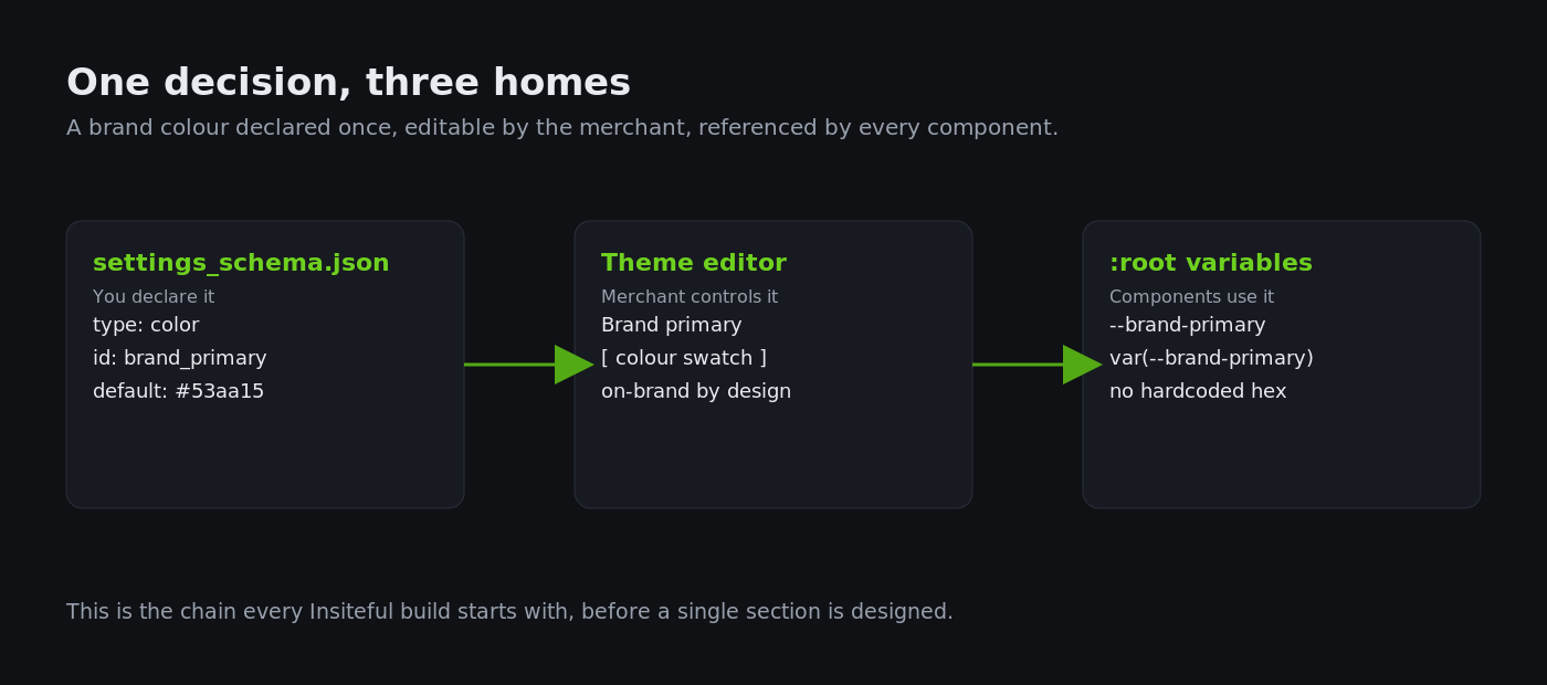
Shopify does not ship a token file called tokens.json. It gives you something better suited to a storefront: a merchant-editable settings layer that compiles down to CSS custom properties. The chain is simple once you see it. You declare a design decision in config/settings_schema.json, Shopify surfaces it in the theme editor for the merchant, and you emit it as a CSS variable in layout/theme.liquid so the whole storefront can reference it.
Here is the pattern we put at the top of every build. First, the schema entry that makes a brand colour a real, editable token:
{
  "name": "Brand",
  "settings": [
    {
      "type": "color",
      "id": "brand_primary",
      "label": "Brand primary",
      "default": "#53aa15"
    },
    {
      "type": "color",
      "id": "brand_ink",
      "label": "Body text",
      "default": "#141414"
    }
  ]
}
Then, in theme.liquid, we expose those settings as CSS custom properties on the root element, so every component in the theme can reach them:
<style>
  :root {
    --brand-primary: {{ settings.brand_primary }};
    --brand-ink: {{ settings.brand_ink }};
  }
</style>
Now a button anywhere in the theme is written as background: var(--brand-primary). There is no hardcoded hex anywhere in a component file. When the merchant changes the brand colour in the editor, or when we run a rebrand, the value flows through automatically. As one Shopify theme reference puts it, updating a global variable like --color-foreground changes the default text colour everywhere the theme uses that variable, instead of forcing 200 targeted overrides. That is the whole point, and it is where most stores go wrong: they override, they never tokenise.
The Three-Layer Token Model We Build Into Every Theme
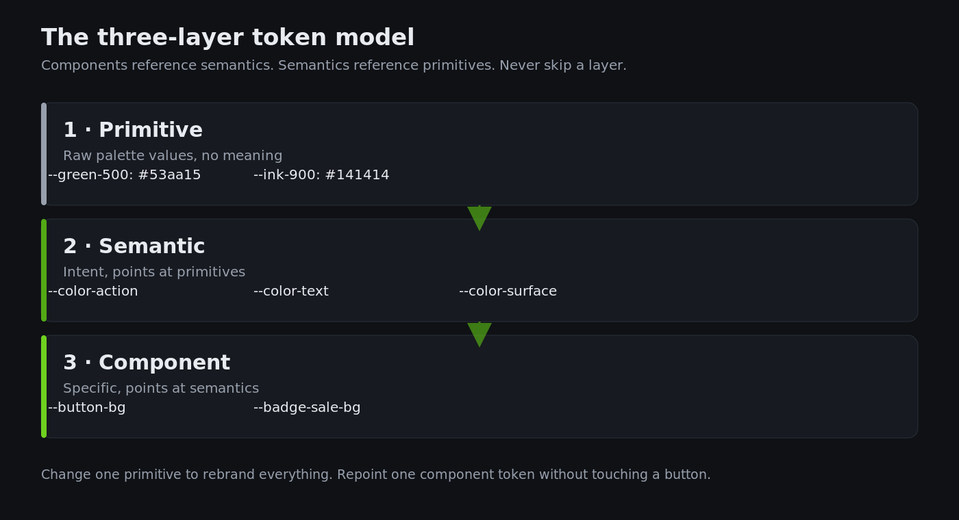
A flat list of colours is where amateurs stop and where brand drift begins. The system that actually survives scale has three layers, and the middle layer is the one that does the work.
Primitive tokens are the raw palette. --green-500: #53aa15. They carry no meaning, just value. Semantic tokens describe intent: --color-action, --color-text, --color-surface. They point at primitives. Component tokens are the most specific: --button-bg, --badge-sale-bg. They point at semantics. Components only ever reference the semantic or component layer, never a raw primitive.
:root {
  /* Primitive - raw values, no meaning */
  --green-500: #53aa15;
  --ink-900: #141414;

  /* Semantic - intent, points at primitives */
  --color-action: var(--green-500);
  --color-text: var(--ink-900);

  /* Component - specific, points at semantics */
  --button-bg: var(--color-action);
  --badge-sale-bg: var(--color-action);
}
Why bother with the middle layer? Because intent is what changes, not values. When a client says “our sale badges need to feel more urgent,” we repoint --badge-sale-bg to a new primitive without touching a single button. When they rebrand from green to navy, we change one primitive and the semantic layer carries it everywhere. This is the structure that let us take a client through a full colour rebrand in three days instead of three weeks, and it is the reason our stylesheets shrink over time rather than bloat. Atlassian reported a 67% reduction in duplicate UI code in the first year of centralising on tokens, with internal consistency scores climbing from 58% to 89%. Those are the exact numbers a three-layer model produces on a Shopify theme.
The Naming Convention We Never Break
A token system lives or dies on its names, and this is where most in-house attempts fall apart. If two developers name the same decision differently, you have two tokens where you needed one, and the drift you were trying to prevent creeps back in through the vocabulary itself. So we lock a naming convention on day one and treat it as non-negotiable across the whole theme.
Our convention reads category, then role, then optional variant and state, separated by hyphens. It is boring on purpose. Boring is predictable, and predictable is what a marketer, a new developer, and a designer in Figma can all read without a meeting.
--color-action           /* category-role */
--color-action-hover     /* category-role-state */
--space-section-y        /* category-role */
--radius-button          /* category-role */
--text-heading-lg        /* category-role-variant */
Because the names map cleanly to the Design Tokens Specification’s category structure, they also survive the trip out of Figma. When Emma designs in Figma using the same token names the theme uses, the handoff stops being a translation exercise and becomes a copy exercise. The word “primary” means the same thing in the design file, the theme editor, and the CSS, which is exactly the kind of shared vocabulary the October 2025 spec was written to guarantee. A convention this rigid feels heavy for a five-page store. On a storefront that will run for years and be touched by a dozen people, it is the cheapest governance you can put in place.
Color Schemes Are Shopify’s Native Token System, So Use Them Properly
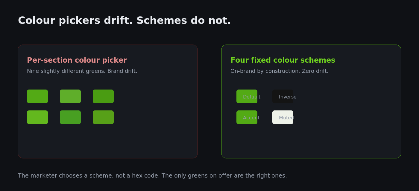
Here is the part most themes underuse. Shopify’s color schemes feature is, functionally, a semantic token system built into the platform. A color scheme is a named group of related colours (background, text, button, button label) that you apply to a section. Modern themes support up to 21 schemes, drawing from a palette you define of between 2 and 20 named colours. When you assign “Scheme 1” to a section, Shopify emits the scheme’s values as CSS variables scoped to that section.
We treat schemes as the merchant-facing semantic layer. Instead of giving a marketer a colour picker on every section (which is how storefronts end up with nine slightly different greens), we build a small, deliberate set of schemes: a light default, a dark inverse, a brand-accent block, and a muted band. The marketer chooses a scheme, not a hex code. The brand cannot drift because the only choices available are on-brand by construction. This is the same discipline we describe in our guide to building Shopify colour schemes that stay on-brand, applied at the token level.
.section {
  background: var(--color-scheme-background);
  color: var(--color-scheme-text);
}
.section .button {
  background: var(--color-scheme-button);
  color: var(--color-scheme-button-label);
}
The payoff is governance without friction. The merchant gets flexibility, we get guardrails, and nobody is emailing the agency to ask “what is the exact green again?” because the exact green is the only green the editor will offer.
Typography and Spacing: The Two Token Sets Merchants Always Break
Colour gets all the attention, but the two token sets that quietly destroy visual consistency are type and spacing. A storefront with a tokenised colour system and untokenised typography still looks incoherent, because headings arrive at random sizes and sections breathe at random rhythms.
We tokenise type as a scale, not a set of pixel values, and we make it fluid with clamp() so it responds across viewports without a dozen media queries. Each step references the one below it, which keeps the ratio locked.
:root {
  --font-scale: 1.25;             /* major third */
  --text-base: clamp(1rem, 0.95rem + 0.3vw, 1.125rem);
  --text-lg:   calc(var(--text-base) * var(--font-scale));
  --text-xl:   calc(var(--text-lg) * var(--font-scale));
  --text-2xl:  calc(var(--text-xl) * var(--font-scale));
}
h1 { font-size: var(--text-2xl); }
h2 { font-size: var(--text-xl); }
Spacing follows the same logic: a base unit and a scale, referenced by name everywhere. Section padding, grid gaps, and stack spacing all pull from the same set of tokens, so a section built next year automatically shares the rhythm of a section built today. When we pair this with a properly wired font stack (the mechanics of which we cover in our piece on loading custom fonts on Shopify without hurting speed), typography stops being the thing that gives a store away as stitched-together. The research backs the stakes: inconsistent UI patterns have been measured to increase user errors by 34% and task abandonment by 19%, while consistent systems lift conversion by 5 to 12% within 18 months. Spacing and type consistency is not a designer’s vanity. It is measurable revenue.
Governance: Keeping Tokens On-Brand After 100 Product Uploads
A token system is only as good as the constraints around it. The failure mode we see most often is a beautifully tokenised theme that a well-meaning marketer slowly undermines by pasting custom CSS into the theme’s Custom CSS box, or by using a section’s colour override to “just quickly” match a campaign. Six months later the tokens are still there but half the storefront ignores them.
Our governance model has three parts. First, we remove the temptation: we strip per-section colour pickers wherever a scheme will do, so the merchant physically cannot enter an off-brand hex. Second, we document the tokens in-context, with a hidden “brand reference” template in the theme that renders every token as a live swatch, so the team can see the system rather than guess at it. This is the storefront-level cousin of the full Shopify design system we build for larger clients. Third, we lock the primitive layer: primitives live in a file the merchant does not edit, and only semantic and component tokens are exposed. The merchant can adjust the brand within the guardrails; they cannot break the foundation.
This is also where a token system earns back its cost on maintenance. When a client asks for a change, we are not hunting through a template’s inline styles, we are changing a named value with a predictable blast radius. Toyota, applying a design system across its digital properties, eliminated 80% of interface inconsistencies within six months and saw a 23% lift in satisfaction scores. The mechanism at the storefront scale is identical: constrain the choices, and consistency stops being a thing you police and becomes a thing the system enforces.
What Tokens Do for Core Web Vitals
There is a performance dividend that rarely gets mentioned. A tokenised theme carries dramatically less CSS than an override-driven one. When every component references variables, you do not accumulate the long tail of !important overrides and one-off selectors that untokenised stores pile up. Less CSS means a smaller render-blocking payload, which feeds directly into Largest Contentful Paint and the cumulative layout stability that Google measures.
We also use tokens to prevent layout shift directly, reserving space with tokenised dimensions so images and embeds do not reflow content as they load. Cumulative Layout Shift is a Core Web Vital, and a single unreserved hero image can wreck it. Pinning dimensions to a token keeps that ratio consistent across every template that reuses the block:
.media {
  aspect-ratio: var(--ratio-hero);   /* one token, every hero */
  width: 100%;
}
:root { --ratio-hero: 16 / 9; }
On one migration we inherited a theme where the previous build had 340-odd lines of override CSS fighting the base theme. Rebuilding it on a token layer cut the custom stylesheet by more than half and dropped a render-blocking chunk of CSS off the critical path. A storefront that speaks in tokens tends to be a faster storefront, almost as a side effect, which is why our token work and our product page builds are never separate conversations. Clean structure and speed come from the same discipline.
How We Do It at Insiteful
Every Insiteful build starts with tokens before a single section is designed. We open the brand book, translate it into a primitive palette, a type scale, and a spacing scale, then wire the semantic and component layers on top. Only then do we build sections, and every section is written against variables from day one. There is no “we will clean up the CSS later,” because there is no CSS to clean up.
We define the Shopify color schemes as the merchant-facing semantic layer, deliberately small, so the theme editor only ever offers on-brand choices. We ship a live brand-reference template with the theme so the client’s team can see the token system rather than reverse-engineer it. And we lock the primitive layer out of the editor so the foundation cannot be edited by accident during a busy campaign week. The result is a storefront that a marketing team can run at speed without the brand quietly coming apart, and one where a future rebrand is a controlled, low-risk change rather than a rebuild.
We have run this system across storefronts turning over from a few hundred thousand to several million AUD a year. The pattern holds at every size: the token layer is the cheapest insurance you will ever buy against the slow, expensive drift that eventually forces a full redesign. On one client we estimate the token architecture saved roughly $18,000 AUD in avoided rebuild time across two rebrands in a single year.
Build a Storefront That Stays On-Brand as It Scales
If your Shopify store already feels like it is drifting, with campaign pages that do not quite match and a stylesheet nobody wants to touch, a token system is the fix, and it is retrofittable. If you are building new, it is the foundation to lay first. Either way, this is the kind of structural work that pays for itself every time you change something.
If you want a storefront built on a proper token foundation, or an existing one brought back under control, book a build assessment with Insiteful and we will show you exactly where your brand is leaking and what it takes to lock it back down.