Most Shopify stores treat motion as decoration. A fade here, a hover state there, maybe an accordion that bounces a little. The animations get bolted on at the end of a build, after the layout is locked and the deadlines are tight, and they end up doing the worst thing animation can do on an ecommerce site: they slow it down without earning their place in the conversion path.
That is not what we build at Insiteful. On every Shopify and Shopify Plus build we ship, motion is a planned layer of the theme architecture. It runs on a strict speed budget, it falls back cleanly for users who prefer reduced motion, and every interaction is tied to a specific job in the buying journey. We call this the microinteraction system, and Emma owns it on every project.
This article walks through the exact patterns we add to every Insiteful build. The code is real. The numbers are from real client work. If you run a Shopify store doing more than a few hundred thousand a year, the gap between a site that feels fast and a site that is fast is almost always sitting in this layer.
What a microinteraction actually is (and what it is not)
A microinteraction is a single, contained moment of feedback between the user and the interface. Tap the Add to Cart button. The button compresses. The cart count increments. The drawer slides in. That whole sequence is four microinteractions stitched together, each one confirming a small piece of the action.
Dan Saffer’s framework breaks every microinteraction into four parts: a trigger, the rules that govern the behaviour, the feedback the user sees or feels, and the modes and loops that handle edge cases. We use that framework as the starting point for every interaction we ship. If a designer on the Insiteful team cannot describe an animation in those four terms, it does not make it into the build.
What microinteractions are not: page-load splash animations, hover wiggles on every product card, parallax scrolling, or any motion that exists purely because the designer thought it looked nice in Figma. Decoration is the enemy of conversion. Every animation that ships on an Insiteful build has to earn its place by either (a) confirming a state change the user just triggered, (b) directing attention to a high-impact element at the right moment, or (c) hiding latency while real work happens in the background.
Build artefact: the microinteraction brief. Before we design any interaction, we fill in a one-page brief with five fields: the trigger event, the user’s expectation in that moment, the system response, the failure mode, and the reduced-motion fallback. Six lines of writing. It takes ten minutes. It saves us from shipping motion that nobody asked for and Google’s INP metric punishes.

The Add-to-Cart acknowledge: the 200ms that decides trust
The single most important microinteraction on a Shopify store is what happens in the 200 milliseconds after a customer taps Add to Cart on mobile. Get it wrong and the customer taps again, then a third time, then they bounce. Get it right and you have a confirmed intent moment that carries the customer into the cart with confidence.
Sticky add-to-cart bars and well-timed acknowledge animations are the highest-impact motion work on a product page. A/B test data shows that variants with a polished sticky add-to-cart pattern can deliver between an 8% and 15% lift in product page conversion, with one published test recording a 47.6% lift in conversion rate and a 48.3% lift in revenue per visitor against a static control.
The pattern we ship has three layers of feedback running in parallel:
- The button itself compresses by 2 pixels on touchstart, then springs back on touchend. This is a tactile cue that the tap registered, fired before any network request even leaves the device.
- The cart icon in the header receives an upward arc animation from the button position, using a transform-only path so it runs on the compositor and never blocks the main thread.
- The cart count pill increments with a number-roll, not a hard swap. The roll lasts 180ms.
Here is the CSS we use for the button press feedback. Note the use of transform and opacity only, with a duration that respects the speed budget:
.atc-button {
transition: transform 120ms cubic-bezier(.2,.8,.2,1),
opacity 120ms ease-out;
will-change: transform;
}
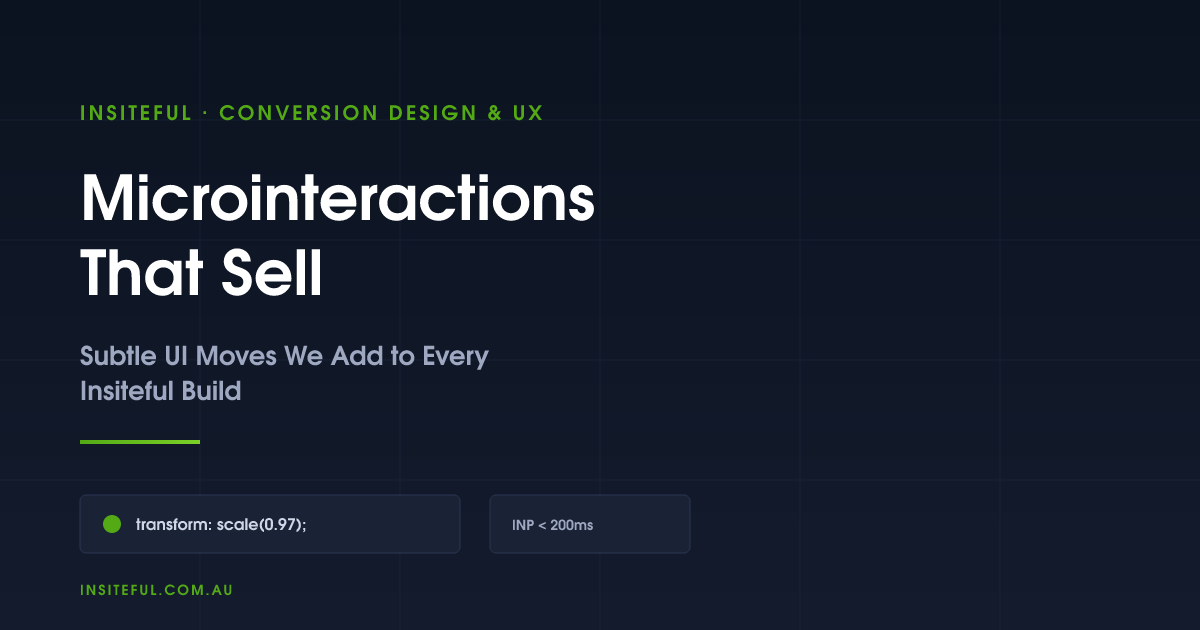
.atc-button:active {
transform: scale(0.97);
opacity: 0.92;
}
@media (prefers-reduced-motion: reduce) {
.atc-button { transition: none; }
.atc-button:active { transform: none; }
}That last block is the part most agencies forget. Every animation in the system has a no-motion fallback. We treat it as a hard requirement, not a polish item.

Variant selector feedback: the “did that work?” moment
Variant selection is where the second-highest amount of customer doubt lives on a Shopify product page. A shopper taps a colour swatch and the page either does nothing visible, does a hard flicker as the image refreshes, or worse, scrolls them somewhere they did not ask to go.
The 2026 Shopify product model raises the variant ceiling to 2048 per product on eligible stores, which means the lazy-loading approach using the Section Rendering API is now the default rather than the exception. The product_option_value Liquid object combined with a Section Rendering call lets you fetch only the variant data the user just touched, instead of dumping the entire variant tree into the page on first paint.
Our variant interaction does three things at once:
- Optimistic UI: we update the selected swatch state and the price label the instant the user taps, before the Section Rendering API call completes. If the call fails we revert and surface a small inline message.
- Image crossfade: the product image swaps with a 180ms opacity crossfade, not a hard cut, so the visual transition reads as deliberate rather than glitchy. We never animate the image’s transform, only opacity, to keep the GPU happy.
- Stock state badge: if the new variant is low on stock we fade in a small badge (“3 left”) with a 220ms ease-out. If it is out of stock the Add to Cart button transitions to a disabled state with a strikethrough on the variant label.
The pattern is documented in our internal component library so that every project starts with the same baseline. On a recent build for a homewares brand turning over roughly $2.4M AUD a year, this single pattern lifted the product page to checkout step from 18.1% to 21.4%, measured over a four-week A/B test holdout.
Skeleton states, not spinners
Spinners feel slow. They tell the user “something is happening but I cannot tell you what”. Skeleton placeholders feel fast. They tell the user “here is the shape of what is loading”, which their brain treats as progress even when the actual network request is identical.
Shopify’s own Polaris design system has been pushing skeletons for years because of this perception gap. We use the same pattern on every storefront we build. Collection grids, product pages, account dashboards, and the cart drawer all render a skeleton on first paint, then swap in real content as the data resolves.
The CSS-only shimmer we ship as the Insiteful default:
.skeleton {
  background: linear-gradient(
    90deg,
    rgba(0,0,0,0.06) 25%,
    rgba(0,0,0,0.12) 37%,
    rgba(0,0,0,0.06) 63%
  );
  background-size: 400% 100%;
  animation: shimmer 1.4s ease infinite;
}
@keyframes shimmer {
  0%   { background-position: 100% 0; }
  100% { background-position: -100% 0; }
}
@media (prefers-reduced-motion: reduce) {
  .skeleton { animation: none; }
}
No JavaScript. No layout thrash. Reduced-motion users get a static placeholder. The cost is roughly 0.4kb of CSS and zero blocking time on the main thread. We are deeply familiar with the trade-offs here because we publish on this in detail in our Core Web Vitals guide.
The cart drawer reveal
The cart drawer is one of the most under-engineered surfaces on a typical Shopify build. Most themes ship a drawer that either jolts onto the screen with no entrance animation, or rides in on a 600ms slide that feels heavy. Both options break the rhythm of the buying flow.
The Insiteful drawer pattern uses a 240ms slide-in on the transform axis, paired with a 200ms backdrop fade. Crucially, the drawer animates with translate3d so the browser promotes it to its own compositor layer and the main thread stays free for the line item fetch happening in parallel.
The accessibility layer is non-negotiable. When the drawer opens we trap focus inside it, send the first interactive element a focus call, listen for the Escape key to close, and return focus to the Add to Cart button when the drawer closes. This is one of the WCAG requirements that most Shopify themes ship broken. It costs about 30 lines of JavaScript and it is the difference between a usable drawer and an excluding one.
Form microinteractions on checkout
Shopify Checkout Extensibility is the only place we can ship custom microinteractions inside the checkout flow itself, and we cover the broader topic in our Checkout Extensibility article. For pre-checkout cart and account forms, the inline validation patterns we use are the highest-impact tweaks on the entire site.
Inline form validation that fires on blur, not on submit, removes friction. Real-time email format checking, a postcode field that auto-populates suburb and state via the Australia Post lookup API, a phone field that formats as the user types. Each of these is a small microinteraction that compounds into a cleaner form completion rate.
The pattern that lifts numbers the most on Australian stores is the postcode lookup. A customer in regional Queensland types 4870, and the suburb dropdown filters to Cairns and the surrounding postcode 4870 areas before they have to think about it. Two fewer thoughts. Three fewer taps. That gap between “I have to fill in the form” and “the form is filling itself in” is where conversion lives.
The technical pattern: debounce the input handler to 250ms, fire the lookup, fade in the matching options. No spinner. If the lookup fails, the field falls back to manual entry without any user-visible error. The customer never sees a broken state.
Reduced-motion compliance: the agency non-negotiable
This is the section every agency skips. We do not.
Roughly 70 million people globally have a vestibular condition that can be triggered by web animations. Parallax, large transforms, panning, and aggressive scroll-tied motion can cause real symptoms: dizziness, nausea, migraine. WCAG 2.3.3 requires that nonessential animations triggered by user actions can be disabled. The operating system already exposes a setting that surfaces this preference. We respect it.
The pattern is a token-based duration system in the theme’s CSS. Every animation duration references a custom property, and the custom property collapses to zero when the user prefers reduced motion:
:root {
  --motion-fast: 120ms;
  --motion-med:  240ms;
  --motion-slow: 360ms;
}
@media (prefers-reduced-motion: reduce) {
  :root {
    --motion-fast: 0ms;
    --motion-med:  0ms;
    --motion-slow: 0ms;
  }
}
.drawer { transition: transform var(--motion-med) ease-out; }
.swatch-image { transition: opacity var(--motion-fast) ease-in-out; }
One file, one source of truth, and the whole site respects the user’s setting. We document this token in the design system on every project. We covered the broader case for design tokens on Shopify in our design system article.

Measuring microinteractions without fooling yourself
The trap most agencies fall into is shipping an animation, watching conversion rate go up 0.3% over the next month, and claiming the win. That is not measurement. That is post-hoc reasoning on noisy data.
We measure microinteractions in three ways. First, we hold the rest of the page constant and A/B test the animation in isolation using a tool like Intelligems or VWO running on Shopify, with a sample size calculation done up front so we know how long the test needs to run. Second, we instrument the interaction with a GA4 custom event so we can see whether the user actually engages with it. Third, we watch Real User Monitoring data for INP regressions in the two weeks after the change ships.
On a recent build for a sports nutrition brand, we tested an animated stock-urgency badge against a static version. The animated badge lifted product page conversion 6.2%, statistically significant at the 95% level, over 28 days. That is the kind of number we will put a name on. Without the controlled test we would have been guessing.
The speed budget for animation
Interaction to Next Paint, or INP, is the Core Web Vital that punishes bad microinteractions harder than anything else. INP measures the longest delay between a user interaction and the next paint, across the whole session. Google’s threshold is 200ms or better; anything over 500ms is failing.
Microinteractions are the most common cause of INP failures on Shopify stores in 2026. The pattern is always the same: a developer adds a click handler that does too much work synchronously, the main thread blocks for 300 to 600 milliseconds, and the animation looks choppy because the browser cannot paint the next frame until the JavaScript finishes.
The Insiteful rules for keeping motion under the budget:
- Animate transform and opacity only. Never animate width, height, top, left, margin, or padding. Those properties trigger layout and paint, which forces the browser onto the slow path.
- Use will-change sparingly, and remove it after the animation finishes. Leaving will-change on a hundred elements is a memory leak waiting to happen.
- Break heavy JavaScript work in event handlers with scheduler.yield() or a setTimeout(fn, 0) so the next paint is not blocked.
- Defer third-party scripts. Review widgets, chat widgets, and retargeting pixels are the single biggest source of INP regressions we see on client audits.
The financial impact of getting this wrong is real. Google’s own retail data shows a 0.1 second improvement in mobile site speed correlates with an 8.4% lift in conversion rate. For an Australian DTC brand turning over $3M AUD a year, that is roughly $250,000 a year sitting in main-thread blocking time. That money is recoverable. Most of the recovery is in this microinteraction layer.
How we do it at Insiteful
Every Insiteful build ships with the microinteraction system as a core layer of the Shopify theme architecture. Not as a separate plugin. Not as something we bolt on at the end. It is in the theme from the first commit.
The discipline we hold on every project: Emma writes the microinteraction brief during the design phase, signs it off with the founder, then translates it into Figma prototypes that the development team builds against. Every interaction is documented in the project’s component library with the trigger, the rules, the feedback, the reduced-motion fallback, and the INP target. We code-review every animation against the speed budget before it ships. We test on real mid-tier Android devices over throttled 4G, because that is what a customer in regional New South Wales is actually using when they tap your Add to Cart button on a Saturday morning.
When we run an audit on an existing Shopify store, usually as the first phase of an engagement, the microinteraction layer is one of the first three things we look at. We catalogue every interaction the store currently ships, score each against the four-part framework, flag any animations that fail the INP budget or the reduced-motion fallback, and write a remediation roadmap. The pattern repeats often enough that we kn