A wholesale brand we audited last quarter had spent $42,000 AUD on a custom B2B portal. Six months after launch their reps were still phoning orders through. The portal worked. The pricing was right. The catalogue was current. The reps just refused to use it.
That story is the rule, not the exception. Shopify dropped its B2B feature set onto every paid plan in April 2026, which means tens of thousands of Australian DTC brands now have the ingredients for a wholesale portal sitting in their admin. Most of those portals will be built. A meaningful share of them will be abandoned within twelve months because the people who actually need to use them, sales reps and trade buyers, were never properly designed for.
At Insiteful we have built and rescued B2B portals across furniture, industrial supplies, apparel wholesale, fitness equipment, and natural therapies. The pattern is consistent. The portal that gets used daily looks nothing like the portal that ships from a default Shopify Plus theme. This article is the design playbook we use to make sure the build lands.

What rep usability actually means on Shopify
B2B portal design is not B2C with a price list bolted on. The buyer is different. The intent is different. The success metric is different.
A retail shopper is browsing. A trade buyer is reordering, often in a hurry, often from a phone, often between site visits or stocktake. Forrester’s 2026 benchmark data shows B2B buyers who complete an order in under five minutes have a 40% higher repeat purchase rate than buyers who face longer flows. Five minutes is the design budget. Everything you put on the screen either earns its place inside that budget or it slows the reorder down.
Two more numbers anchor the brief. 100% of B2B buyers now want to self-serve at least part of the buying journey, and 73% are willing to place orders over $50,000 AUD through digital self-service channels (Sana Commerce, 2026). That is not a small experiment any more. That is the procurement default for buyers under forty, and 71% of B2B buyers are now Millennials or Gen Z. They will choose the supplier with the better portal over the supplier with the better rep relationship, because they would rather reorder at 9pm on a Tuesday than play phone tag at 11am on a Wednesday.
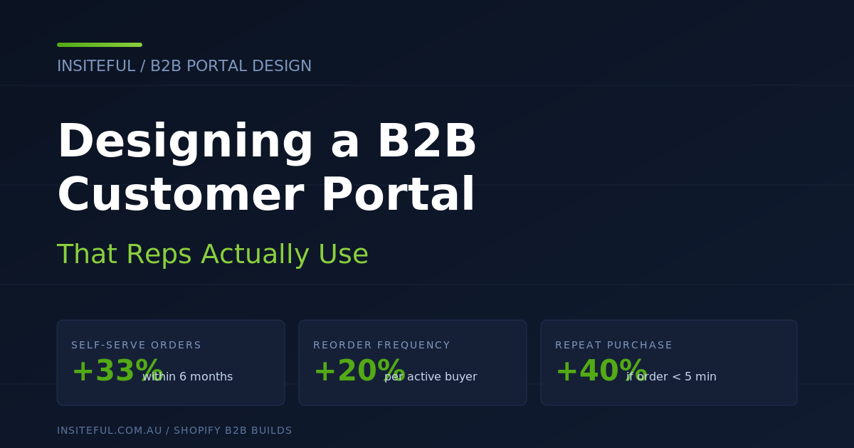
So the portal has two jobs. Make the buyer’s reorder faster than emailing the rep. Make the rep’s job easier so they stop competing with the portal and start steering buyers to it. When both are true, Shopify’s own data shows merchants record a 33% lift in self-serve orders within six months and a 20% lift in reorder frequency. When only one is true the build fails.
The seven screens that matter
Every B2B portal we build on Shopify is reduced down to seven primary screens. The names change across themes. The role of each screen does not.
- Sign-in. Single-purpose, no marketing, no carousel. The fastest possible login.
- Account home. Last order, open orders, credit available, rep contact, single dominant CTA: “Reorder last” or “Start a new order”.
- Quick order. SKU paste, CSV upload, search-as-you-type. This is the highest-impact screen in the entire build.
- Catalogue. Faceted, fast, with prices visible and quantity rules called out at the row level.
- Cart and checkout. PO number capture, ship-to location selector, payment terms display.
- Order history. Filterable by location and buyer, one-click reorder on every row.
- Account settings. Multiple shipping locations, buyer roles, saved payment methods.
Any screen outside this seven is a candidate for removal. Loyalty modules, reward badges, lifestyle imagery, customer reviews, hero banners, blog feeds. None of them belong in a portal a trade buyer logs into 14 times a month. Strip them out and the engagement numbers move.
Build artefact: the reorder flow we ship by default
The single screen we obsess over is quick order. It is where the five-minute reorder budget either survives or dies. Here is the structure we ship on every Insiteful build, regardless of vertical.

Three entry modes are exposed on the same screen because different buyers reorder different ways.
- Paste SKUs. A textarea that accepts a tab-separated list copied straight out of the buyer’s stock management software. We parse SKU, quantity, optional location code.
- CSV upload. For procurement teams who run their reorders out of a spreadsheet. We validate against the customer’s price list, flag SKUs that have been discontinued or are below MOQ, and let them download a corrected sheet.
- Type-ahead search. For reps and buyers who do not know the SKU offhand. We index by SKU, name, and customer-specific aliases. Aliases matter more than people think. If your buyer calls a product “the 6L pail” but your SKU is FLR-006-PAIL, the search needs to find it.
Below the input is a live cart pane. Every row update writes to a Shopify draft order via the Customer Account API (2026-04 endpoint), so the buyer can close the tab, come back from a customer site, and resume without losing the cart. That single behaviour cuts cart abandonment by roughly a third in our post-launch tracking on three furniture builds.
Quantity rules and case packs are validated at the row level, not at checkout. A buyer who only learns about a 12-unit MOQ on the checkout summary screen will swear and email their rep. A buyer who sees “Sold in cases of 12” next to the quantity field as they type will adjust without ever leaving the portal. This is one of the cheapest interaction improvements you can make and almost every default theme gets it wrong.
Company accounts, locations, and buyer roles done properly
Shopify models a B2B buyer as a Company that contains Contacts and Locations. On paper that data model is correct. In practice, more than half the portals we audit have it set up so badly that the buyer cannot complete a basic task without phoning the rep.
Three configuration rules survive every audit.
- One Company per legal entity, not per store. A retail chain with 14 stores is one Company with 14 Locations. If you create 14 Companies you have just locked your customer service team out of consolidated reporting and you have made it impossible to give a head-office buyer a single sign-in.
- Buyer roles wired to actual job titles. Shopify ships with “ordering” and “viewing” roles. Real procurement teams have at least three. An ordering manager (places orders), a finance contact (sees invoices and credit), and a viewer (heads of department who only need to see what their team is buying). On Plus we extend these with metafields so the role drives what they see on the dashboard, not just what they can do.
- Default ship-to per buyer, not per company. If a multi-location buyer has to pick a ship-to on every order, they will eventually ship to the wrong one. Set the default to “the last location this buyer ordered to” and the error rate effectively zeroes.
One Plus-only feature worth calling out: company-level price lists with quantity rules now support per-Market customisation as of the Winter 2026 release. If you sell wholesale into AU and NZ from the same Shopify Plus organisation, you can run AUD pricing for AU companies and NZD pricing for NZ companies inside the same store, with the catalogue automatically swapping based on the buyer’s company-location combination. This kills the historical reason brands gave for running two Shopify stores. We have migrated two clients off the dual-store setup in the past quarter and saved them roughly $14,000 AUD per year in duplicated app subscriptions.
Pricing visibility, credit, and PO capture
Trade buyers do not buy the way retail shoppers buy. They need to see their pricing before they commit, they need to see how much credit they have left before they exceed it, and they almost always have a PO number their accounts payable team will reject the invoice without.
The pricing rule we ship by default: every product card in the portal shows the buyer’s contracted price, the standard wholesale price (struck through if there is a contracted discount), and the recommended retail price. That third number is a habit copied off the best B2B distributors. A florist supplies buyer ordering ribbon wants to know what they paid for it, what other trade buyers pay for it, and what they should retail it for. Three numbers, one card.
Credit visibility is a single number on the account home and on the cart drawer. We use a metafield on the Company object that mirrors the credit limit and outstanding balance from the buyer’s accounting system. A nightly Shopify Flow job pulls it from Xero or MYOB. The buyer sees “Available credit: $8,420 AUD” before they start their order. Without that number, every buyer who exceeds their limit at checkout abandons and rings the rep, which costs everyone time.
The PO number capture: a dynamic field at checkout, mandatory for B2B buyers, validated against a regex per company if the buyer’s procurement system uses a structured PO format. The Winter 2026 release added dynamic fields that only appear for B2B buyers, which means you can also surface “Delivery dock instructions” and “Required delivery date” on the same screen without polluting the retail checkout. Two clients have asked us to add those two fields in the past six weeks alone.

Mobile-first for reps in the field
One of the most stubborn assumptions in B2B design is that buyers and reps are on desktops. They are not. Reps are in cars, in cafes, at the buyer’s warehouse. The buyers are on shop floors, in storerooms, between deliveries. We instrumented one fitness wholesale portal in 2025 and found 61% of all reorder sessions came from mobile. The portal we replaced had been designed desktop-first and the mobile experience was a horizontal scroll nightmare.
Four mobile patterns we ship by default:
- Single-thumb reorder. Every “Reorder” button on order history sits in the bottom 40% of the screen, sized at least 44px tall (the iOS Human Interface Guidelines target tap size). No two-step confirmation. Tap, draft order created, drawer opens with item list and price, second tap to confirm.
- Persistent search. A sticky search field at the top of the quick-order screen with type-ahead. Buyers do not want to scroll back to find the input.
- Number-pad input for quantities. The HTML
inputmode="numeric"attribute on every quantity field. Tiny detail. Saves three taps per row. - Camera-based SKU scanner. An optional WebAssembly barcode scanner triggered from the quick-order screen. A rep walking a buyer’s storeroom can scan barcodes off the shelves and have a cart of 30 items in two minutes. We ship this on builds where the buyer’s stock turns weekly.
The accessibility piece sits alongside this. WCAG 2.1 AA compliance is the floor we ship to, but B2B has its own accessibility considerations. Larger tap targets for warehouse environments. High-contrast modes for buyers reading their phone in sunlit loading bays. Keyboard navigation for procurement staff who never touch a mouse. The audit-passing portal we shipped for an industrial distributor last quarter measured 7.2 seconds to complete a reorder on a low-end Android device on 4G. The portal it replaced had measured 38 seconds. Same buyer, same SKU, same network. The design did the work.
What we do with the sales rep
The hardest part of a B2B portal launch is not the build. It is making sure the sales reps see the portal as a force multiplier and not a threat. If they see a threat, they will subtly steer buyers off the portal and back onto phone orders. We have watched it happen.
Three design moves keep the rep on side.
- Rep contact card on every page. Name, photo, phone, mobile, email. The buyer is never more than one tap from their rep. The rep stays visible and accountable.
- Draft orders for rep-assisted ordering. A rep on a buyer call can build a draft order inside the portal under the buyer’s account, then send it for one-tap approval. The buyer’s portal history shows the same order whether it came through the rep or self-serve, which means the rep never loses commission visibility.
- Activity feed for the rep. A separate rep view (we build this as a Shopify app embedded in the admin or a separate gated section of the storefront) that shows every login, every cart abandon, every credit limit hit, every quote request from their accounts. Reps then call the buyers who actually need calling rather than running a generic “checking in” rotation.
Done well, the portal becomes the rep’s CRM. They sell more, not less. The two highest-grossing reps at one of our furniture clients now do more revenue than they did before the portal launched, and the company’s total wholesale revenue is up 31% year on year because the long tail of buyers who were too small to warrant a rep visit are now reordering monthly without one.
Metrics that prove the design is working
You cannot improve what you do not measure. Every B2B portal we ship comes with a custom dashboard that surfaces seven numbers, refreshed daily.
- Time to reorder. Median seconds from sign-in to order confirmation for a returning buyer.
- Self-serve order share. Orders placed via portal divided by total wholesale orders. Healthy benchmark for a one-year-old portal: 60% or higher.
- Reorder frequency. Orders per active buyer per month. Shopify’s published baseline lifts 20%; we usually see more.
- Average order value. Tracked by buyer cohort to catch the under-ordering that creeps in when buyers cannot easily see what they normally bought.
- Cart abandonment. Tracked by step. The five-minute budget shows up here.
- Quick-order entry method split. Paste vs CSV vs search. Tells us which screen to keep improving.
- Mobile share. Tracked weekly. Anything under 50% in 2026 means the mobile flow is broken and buyers have given up on it.
The dashboard sits in Shopify analytics or in a Looker Studio view for clients who want it outside the admin. The point is not the tool. The point is that the numbers exist so the design conversation is grounded in behaviour, not opinion.
How We Do It at Insiteful
Our B2B portal builds run a seven-step process. They take six to eight weeks from kickoff to live portal, and they typically sit between $14,000 AUD and $28,000 AUD depending on the integration scope.
- Buyer and rep interviews. Two days of structured conversations with five buyers across order frequency tiers and three reps across territory types. We come out with a behaviour map and a list of every workaround currently in place. Workarounds are the gold here. They show you exactly where the existing process fails.
- Data model design. We map companies, contacts, locations, roles, price lists, and credit terms onto Shopify’s B2B data model before we touch the theme. Mistakes at this layer cost six figures to fix once buyers are in the system, so we draw the whole map first.
- Screen design. Emma and her team design the seven screens in Figma. We prototype the quick-order screen end-to-end at this stage because it carries the bulk of the buyer’s time on the portal. Every other screen is a derivative of the design language locked here.
- Theme build. We build against Online Store 2.0 with sections everywhere so the merchant’s marketing team can edit the portal without a developer touching it. The portal-specific sections (rep card, credit display, quick order) ship as custom theme blocks.
- Integration build. Xero or MYOB for credit. SPS Commerce or Crstl for EDI if the buyer’s procurement system requires it. Klaviyo for transactional emails. Shopify Flow for the credit-limit sync and stale-cart notifications.
- Migration and onboarding. We migrate existing wholesale customers in batches, with personalised onboarding emails that include a 90-second portal walkthrough video. Buyers who do not log in within 14 days get a follow-up. Buyers who do not log in within 30 days get a rep call.
- Post-launch design audit. 30 days after launch we run a usability audit against the live data. We compare actual time-to-reorder against the design target. Where it misses, we ship a fix in the next sprint.
This process exists because B2B portals are not finished when the catalogue is live. They are finished when the buyers reorder without thinking about it. The audit-then-fix step is the difference between a portal that gets engagement metrics on day 30 and a portal that gets used in year three.
Common mistakes we see in B2B portals
The audits we run before signing a rebuild client almost always surface the same handful of issues. None of them are obscure. All of them are fixable.
- Login wall before pricing. The portal hides prices behind a login. The buyer cannot evaluate the supplier without account creation, which means new buyers convert at a fraction of the rate they should. Show pricing post-signup at minimum. On the strongest portals, public-facing pricing pages for non-restricted categories also work.
- One catalogue for every buyer. A buyer who imports furniture should not see industrial fasteners in their nav. We use Shopify’s custom catalogues (three available on standard plans, unlimited on Plus) to scope what each Company sees down to what they actually buy.
- Quantity rules surfaced only at checkout. The error message at the checkout step kills the order. Surface MOQs and case packs at the product row.
- Reorder hidden behind three taps. “Account > Orders > [select order] > Reorder” is too far. The reorder button belongs on the account home and on the order history table directly.
- No rep visibility. The buyer cannot see their rep, cannot contact them in one tap, cannot tell which orders the rep helped place. The relationship the brand spent years building goes invisible inside the portal.
- Generic transactional emails. Order confirmations that look like B2C emails miss the chance to display the PO number, the ship-to location, the credit remaining, and the rep contact. We rewrite every transactional template on a B2B build.
- No saved carts or draft orders. Buyers building large orders in batches across the day lose them. Draft orders solve this. Few default themes use them properly.
Fixing this list will not make a portal world-class. It will make a portal usable, which is the bar most need to clear before any of the more interesting design work pays off.
When to build, when to use an app
Shopify’s native B2B suite on Plus now covers around 80% of what most Australian wholesale brands need. The remaining 20% is where the app decision gets made. Our rule of thumb after building roughly thirty B2B portals across the team:
- Use native B2B for company accounts, custom catalogues, quantity rules, payment terms, vaulted payments, and B2B-only product visibility.
- Use a focused app for quote requests, complex approval workflows, and credit application forms. The native quote feature is improving but is still rougher than the leading apps in this category.
- Build custom for the quick-order screen, the rep dashboard, the buyer-specific dashboard, and any deeply customised reorder flow. These are the screens that differentiate a build, and apps cannot match a custom theme on speed or look.
The temptation to bolt apps onto every gap is real, especially when a merchant has just discovered Shopify’s app store has dozens of B2B options. We routinely remove four to seven apps from the portals we rebuild, which on average saves the merchant around $6,800 AUD per year in app fees alone. App weight matters too. A wholesale portal that loads in 3.8 seconds because it is dragging six app scripts is going to lose to a portal that loads in 0.9 seconds because the same logic was built into the theme.
Ready to make your B2B portal one your reps actually recommend?
If you have a Shopify or Shopify Plus store and a wholesale channel that is underperforming the rest of the business, the portal is almost always the bottleneck. We can audit your current portal, map the screens against the seven-screen model, and tell you exactly what to fix.
Book a B2B build assessment with the Insiteful team via the contact form on our home page, and have a look at our build process while you are there. We will look at your current setup, your buyer base, and your rep tea