Most Shopify stores get rebuilt from scratch every 18 months. Not because the technology failed, but because the design did.
A new campaign needs new colours. A rebrand lands and nobody knows which hex codes are “official” anymore. The developer applies the brand primary to a button, the designer uses a slightly different shade in Figma, and the two never match. Three years in, you have six shades of green scattered across 40 sections and nobody can tell you which one is correct.
This is not a brand problem. It is a system problem. And for a Shopify store doing $500k or more per year, fixing it reactively costs between $40,000 and $120,000 over three years in accumulated rebuild hours, agency fees, and developer time spent decoding undocumented theme decisions. Building a design system upfront costs a fraction of that and compounds in the other direction.
What a Shopify Design System Actually Is (It’s Not a Brand Book)
Brand books define identity. Design systems define implementation. They are different things, and confusing them is where most Shopify projects go wrong.
A brand book tells you the logo clear space, the approved colour palette, and the typeface hierarchy. A Shopify design system translates all of that into the actual variables, component schemas, and section structures that live inside your theme code. It is the layer between “this is who we are” and “this is how the button renders on mobile”.
In practice, a Shopify design system is a documented set of:
- Design tokens — named values for colour, type, spacing, radius, shadow, and motion that serve as the single source of truth across Figma and theme CSS.
- Section block schemas — the structured settings panels in
sections/*.liquidthat editors use to configure components without touching code. - Component documentation — usage rules, dos and don’ts, and accessibility requirements for each reusable piece of UI.
- Handoff conventions — the agreed process for how a Figma design gets translated into a Liquid section without information falling through the gaps.
Done properly, anyone on the team, whether a junior developer, a senior designer, or a merchandiser making content updates, is working from the same source of truth. Done poorly, every project starts with an archaeology exercise to work out what actually exists in the theme.
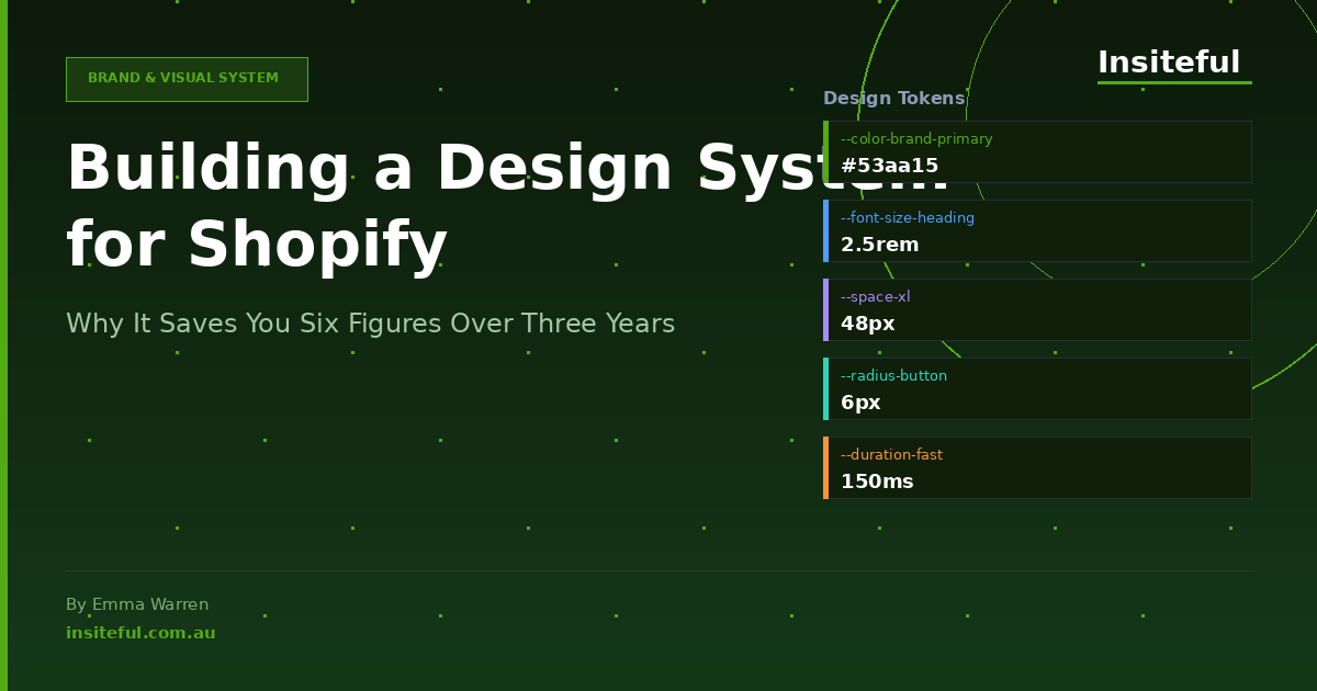
The 7 Token Categories We Use on Every Build
Tokens are the atomic layer of a design system. They give every visual decision a name instead of a raw value. When a token changes, every component that references it updates automatically. That is the compounding ROI.
At Insiteful, we structure tokens across seven categories on every build:
| Token Category | Examples | Why It Matters |
|---|---|---|
| Colour | --color-brand-primary, --color-surface-default, --color-text-muted | Prevents the “six shades of green” problem. One source, all components. |
| Typography | --font-family-heading, --font-size-lg, --line-height-body | Consistent reading experience and predictable mobile scaling. |
| Spacing | --space-xs (4px), --space-md (16px), --space-xl (48px) | Removes arbitrary padding decisions that accumulate into chaos. |
| Border Radius | --radius-button, --radius-card, --radius-input | Brand feel is mostly radius and shadow. Lock it down early. |
| Shadow | --shadow-card-default, --shadow-overlay | Depth and elevation cues need consistency across the product. |
| Motion | --duration-fast (150ms), --easing-standard | Animation that feels off-brand is often just mismatched timing. |
| Accessibility | --color-focus-ring, --color-error-text (WCAG AA contrast) | Accessibility tokens built in at the start cost nothing. Adding them later is expensive. |
In the theme, these live as CSS custom properties in assets/tokens.css and are referenced throughout the component stylesheets. In Figma, they are a matching variable library connected to every frame. When the brand team decides to shift the primary green two shades darker, the Figma update propagates across designs in minutes and the developer changes one value in tokens.css. Both environments stay in sync without a single manual find-and-replace.
A well-structured token layer typically reduces theme maintenance time by 30 to 40% over a two-year period, based on what we observe across Insiteful client builds. The first campaign after launch is where founders feel it most: zero archaeology, zero guessing, one variable changed and done.

Section Blocks as the System Unit
In Shopify’s Online Store 2.0 architecture, sections and blocks are the building units of every page. They are also the natural container for your design system components. Every section schema is, in effect, a component specification: it defines what settings exist, what values are permitted, and how the editor can configure the UI without breaking the design intent.
A design system for Shopify does not just document Figma components. It documents how those components map to section schemas. That mapping is where most agencies fall short.
Here is a simplified example of a schema for a “Feature Banner” section that references design system tokens in its settings:
{
  "name": "Feature Banner",
  "settings": [
    {
      "type": "color",
      "id": "background_color",
      "label": "Background colour",
      "default": "{{ settings.color_brand_primary }}"
    },
    {
      "type": "select",
      "id": "spacing_variant",
      "label": "Section padding",
      "options": [
        { "value": "compact", "label": "Compact (var(--space-md))" },
        { "value": "standard", "label": "Standard (var(--space-xl))" },
        { "value": "generous", "label": "Generous (var(--space-2xl))" }
      ],
      "default": "standard"
    },
    {
      "type": "select",
      "id": "button_style",
      "label": "Button style",
      "options": [
        { "value": "primary", "label": "Primary" },
        { "value": "secondary", "label": "Secondary" },
        { "value": "ghost", "label": "Ghost" }
      ]
    }
  ],
  "blocks": [
    {
      "type": "cta_button",
      "name": "CTA Button",
      "settings": [
        { "type": "text", "id": "label", "label": "Button label" },
        { "type": "url", "id": "url", "label": "Button URL" }
      ]
    }
  ]
}
Notice the schema restricts spacing to three named values mapped directly to token names. An editor cannot accidentally set padding to 37px and break the visual rhythm. The design system is enforced by the schema itself.
This approach also makes content governance significantly easier. When a new developer joins the team 18 months after launch, the schema communicates intent without requiring a design briefing. The system is self-documenting at the schema level.
Figma to Theme Handoff (The Bit That Always Breaks)
The handoff between Figma and Liquid is where design systems most commonly collapse. A designer builds a beautiful component in Figma with careful token references. The developer receives the file, sees a set of frames, and starts building from visual inspection rather than specification. Token names get lost. Spacing values get eyeballed. Border radii drift by two pixels.
Two pixels does not sound like a problem. But multiply it across 40 sections, two developers, and three years of campaign updates, and you have a theme that no longer matches the brand and no single person who can explain why.
The handoff protocol Insiteful uses on every project has four steps:
- Token parity check before any dev work begins. The Figma variable library and the theme’s
tokens.cssare compared side-by-side. Every variable name and value must match. This takes about 90 minutes on a first build and about 20 minutes on subsequent campaigns once the system is in place. - Annotated component specs in Figma. Every component frame includes a dev mode annotation layer that labels which token applies to each property. This is not optional. If the annotation layer is incomplete, the component is not ready for development.
- Schema-first section development. Developers write the section schema before the Liquid or CSS. This forces a conversation about what editor controls exist before implementation starts and catches “the designer forgot this needs to be editable” problems early.
- Shopify Theme Inspector review pass. Once a section is built, the developer uses Shopify Theme Inspector (the browser extension Shopify provides) to verify that rendered CSS values match the token references in the spec. Any drift is flagged and corrected before the section is signed off.
The most common handoff failure we see in audits of existing Shopify themes: colour values hard-coded in component stylesheets instead of referenced via CSS variables. It is a 30-second fix per component during a build and a significant refactor two years later when the brand changes. The right time to fix it is always before launch.

The 3-Year Cost of NOT Having a Design System
The objection we hear most often: “We don’t need a design system, we’re not a big enough brand yet.” Here is what that assumption costs in practice.
In Year 1, the store launches without a token layer or documented component library. The theme works. Every campaign is built by whoever is available. Colours get added inline. A new section gets built without referencing the existing pattern. By the end of Year 1, there are usually 15 to 20 undocumented custom sections with no schema consistency and no token references.
In Year 2, a rebrand or significant campaign shift arrives. The agency or developer who built the original theme may no longer be available. The new developer spends 20 to 30 hours auditing the existing theme before writing a line of new code. Campaign sections cannot be updated globally because values are hard-coded. The estimate for “just updating the colours and fonts” is $4,000 to $8,000 AUD. The client is surprised. The agency is not.
In Year 3, the cost of maintaining an undocumented theme has accumulated to the point where a full rebuild is cheaper than continued maintenance. A rebuild of a moderately complex Shopify theme in Australia costs $15,000 to $35,000. A design system built at the start of Year 1 would have cost $3,000 to $6,000 and made the Year 2 and Year 3 work faster, cheaper, and more consistent.
Across a three-year window, the cost delta between “design system at the start” and “no design system” is typically $40,000 to $120,000, depending on how actively the store runs campaigns and how many developers touch the codebase. That calculation does not include the compounding cost of brand inconsistency eroding conversion rates, which is harder to quantify but very real.
In our experience auditing Shopify stores before migration or rebuilds, roughly 70% of stores older than two years have at least one category of design token that has fragmented across the theme: multiple font sizes for the same text level, three or four button colour variants none of which match the current brand guide, or section padding values that range from 16px to 80px with no documented logic.

How We Build Design Systems at Insiteful (4-Week Scope)
When a new Shopify build comes through Insiteful, design system setup is a defined deliverable, not an afterthought. Here is how the four weeks break down.
Week 1: Token extraction and Figma setup. We work from the brand guide and any existing digital assets to extract all colour, type, spacing, radius, shadow, and motion values. These get structured into a Figma variable library and a corresponding tokens.css file. Any gaps in the brand guide (and there are almost always gaps) are documented as decisions to be made before Week 2 begins. We also define the accessibility token layer at this stage: focus ring colour, error state colours, and minimum contrast ratios verified against WCAG AA.
Week 2: Section schema architecture. We define the full set of sections needed for the store, write the schemas for each, and document the permitted settings. This is the stage where “how much control does a content editor need?” gets answered explicitly. Over-engineering schemas creates confusion for content teams. Under-engineering them creates developer dependency for every content update. Finding the right balance is a design decision as much as a technical one.
Week 3: Component build with token references. Development begins with the token layer already in place. Every component references variables, not raw values. The handoff annotation layers in Figma are completed before each component is handed to development. Shopify Theme Inspector reviews happen section by section.
Week 4: Documentation and handoff to the client team. We produce a component library document that covers every section: what settings exist, what the intended use is, what the edge cases are, and who to contact if the schema needs extending. For clients with in-house developers or a retainer agency, this document is the system handoff that lets them maintain the theme without re-learning it from scratch each time.
The documentation step is the one most agencies skip because it does not feel like “billable work” in the traditional sense. We consider it the most valuable deliverable of the entire engagement. A well-documented theme with a live design system is an asset the client owns and can build on for years. An undocumented theme is a liability that accrues interest.
The Compound Effect: Where the ROI Actually Lives
The ROI of a design system does not come from the initial build. It comes from every subsequent interaction with the theme.
The first BFCM campaign after launch. The brand refresh 18 months in. The new developer onboarding to add a feature. The merchandiser who needs to update section content without breaking the layout. Each of these events is cheaper, faster, and less risky when a design system is in place. The system pays for itself, on average, before the end of the first year.
In practice, clients who launched with a documented design system report spending 40 to 60% less on developer time for ongoing maintenance compared to clients who launched without one. Campaign builds that previously required 10 to 15 hours of dev time are reduced to 3 to 5 hours because every component is reusable, every token is named, and every schema is already in place.
There is also a less quantifiable benefit: confidence. When a founder can walk into a rebrand knowing exactly where every colour, every spacing value, and every font lives in their theme, the decision to make changes stops being a risk assessment and starts being a creative opportunity. That shift in how founders relate to their store’s design is, in our experience, one of the clearest signals that the system is working.
A Shopify design system is not a luxury for large brands. It is a decision about whether you want your design debt to compound silently for three years or whether you want to own your store’s visual layer from day one.
If you are weighing up a new Shopify build or a significant theme upgrade and wondering whether a design system is worth the investment, that is exactly the conversation we have with founders at the start of every project. Talk to the Insiteful team and we can show you what this looks like for your specific store and brand.