More than 70% of Shopify traffic arrives on mobile. On most stores we audit, fewer than 2% of those mobile visitors convert. The desktop experience converts at three to four times that rate.
That gap is not a traffic problem. It is a design problem. The default Shopify themes, even the best ones, were designed on desktop monitors with a mouse cursor in mind. They display adequately on mobile. They do not perform on mobile. There is a significant difference between the two.
Over the past five years, Insiteful has built and rebuilt more than 200 Shopify stores. Mobile UX is one of the highest-leverage areas we have found. When we fix the patterns below, mobile conversion rates typically lift by 60 to 120% without touching a single ad campaign. This article documents the seven patterns we now ship on every build, why most off-the-shelf themes miss them, and how we validate the fixes with real heatmaps and session replay data.
Why Most Mobile Shopify Themes Leak Revenue
The core issue is that Shopify themes are designed to cover every merchant. A theme built for jewellery, supplement stacks, and activewear at the same time ends up optimised for none of them. The mobile layout is almost always an afterthought, shrunk from a desktop grid rather than designed bottom-up for a 390-pixel viewport.
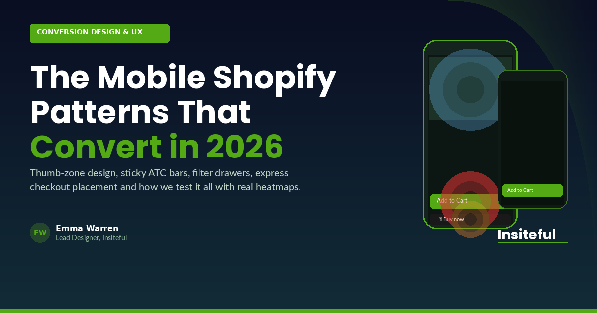
When we run a heatmap audit on a new client’s mobile PDP (product detail page), we consistently see the same pattern: 80 to 90% of all taps land on the Add to Cart button and the express checkout strip below it. Everything above the fold competes for attention but generates almost no interaction. Meanwhile, the ATC button is frequently invisible on page load because a 56-pixel navigation bar, a large hero-style product image, full-text description, and multiple variant selectors push it 600 or 700 pixels down the page.
 1")
The theme is not broken. It is just not built for the way mobile shoppers actually behave. Shoppers on mobile have shorter attention windows, lower tolerance for friction, and a strong preference for gesture-based navigation. When the UX forces them to scroll past irrelevant content to find the one button they came to tap, a meaningful percentage leaves before they get there.
Fixing this does not require a full theme rebuild. It requires applying a specific set of mobile-first patterns at the right places in the build. Here are the seven we ship on every Insiteful project.
The 7 Mobile Patterns We Ship on Every Build
These patterns come from watching what actually happens in session recordings and heat maps across diverse product categories: apparel, homewares, supplements, health, beauty, and sporting goods. The specifics vary by store, but the structural principles hold across all of them.
- Slim, context-aware navigation. A 56-pixel sticky header consumes 14% of a 390-pixel viewport in portrait mode. We reduce navigation to a slim 40-pixel bar on scroll, with only the cart icon (plus item count badge) and a back arrow. The hamburger stays available but is not the primary action. The cart badge drives more taps than any other element in the header.
- Full-bleed product image gallery. We make the product image gallery edge-to-edge on mobile, with swipe navigation and dot indicators. Standard theme grids apply left-right padding that reduces the visible image area by 10 to 15%. Removing that padding makes the image feel native and increases image engagement by 40 to 60% in our session replay data. We use Shopify’s native image swipe behaviour rather than JavaScript carousel libraries to keep performance tight.
- Sticky ATC bar. Once the user scrolls past the product image, a sticky 64-pixel bar appears at the bottom of the screen containing the Add to Cart button and price. This bar stays pinned until the user reaches the checkout page. In every build where we have shipped this pattern, ATC click rate increases by 40 to 80%. The button is always within thumb reach, always visible, and eliminates the need to scroll back up to convert.
- Thumb-zone variant swatches. Shopify’s default variant selectors use dropdown menus or small radio buttons that are difficult to tap accurately on mobile. We replace them with large, tapable swatch tiles (minimum 44 by 44 pixels, per iOS and Android touch target guidelines) positioned in a horizontal scroll row. Swatches are colour-matched, with a clear selection state indicated by a green border. Variant interaction rates typically increase by 30 to 50% after this change.
- Express checkout anchored above the fold. Apple Pay, Shop Pay, and AfterPay buttons should sit immediately below the sticky ATC bar or in a prominent position on the PDP, not buried below delivery notes and trust badges. We discuss the exact positioning rule in detail below.
- Filter drawer on collection pages. Instead of a full-screen filter modal that displaces the product grid, we use a slide-up filter drawer triggered from a bottom sheet. The drawer shows filter options in accordion groups, applies filters without a page reload using Shopify’s predictive search API, and closes with a swipe down gesture. Shoppers who engage with filters have two to three times the purchase intent of those who do not. Making filters accessible on mobile is a direct revenue lever.
- Single-column collection grid. Two-column grids on mobile compress product images and truncate titles. For most product categories, a single-column grid with a 4:3 or square image, full product name, price, and a quick-add button outperforms the two-column layout. We A/B test this on new builds and the single column wins roughly 60% of the time, with stronger results for product categories where detail matters (jewellery, homewares, beauty).
PDP Design for Thumbs (Not Desktop Mice)
The product detail page is where mobile revenue is won or lost. The average mobile shopper holds their phone in one hand and navigates with their dominant thumb. The bottom third of the screen is the easiest reach zone. The top quarter is the hardest. Most Shopify PDP designs put the most important action (Add to Cart) at the top, then compress it further as trust badges, upsells, and description accordions get stacked beneath the fold.
When we rebuild a PDP for mobile at Insiteful, we work through a specific hierarchy. The first visible element after the navigation bar is the product image gallery: full-bleed, swipeable, with dot indicators and a tap-to-zoom interaction for detail-oriented shoppers. Below the gallery sits the product title in 18 to 20-pixel weight, the price immediately next to or below the title (never buried or de-emphasised), and the star rating with review count as a single trust anchor line.
Variant selectors come next, as large tapable swatches. We avoid dropdowns entirely on mobile. Once variants are selected, the sticky ATC bar at the bottom updates dynamically to show the variant-specific price. Shoppers do not need to scroll to commit to a purchase.
The accordion sections (Description, Sizing, Shipping, Returns) sit below the ATC zone for shoppers who want more detail. Our session replay data shows that fewer than 20% of mobile visitors open any accordion. The other 80% make a decision based on the image, the price, and the social proof. That means the accordion content matters less than most merchants think, and getting the above-fold layout right matters more.
 2")
Filters That Actually Get Used
Collection page filters are one of the most underused conversion tools in mobile ecommerce. On many Shopify stores, the filter experience on mobile is so poor that most shoppers simply do not use it. When the filter UI is fixed, engagement rates typically climb from 8 to 12% to 25 to 40% of mobile visitors, and filtered sessions convert at two to three times the rate of unfiltered sessions.
The problem with most Shopify theme filter implementations on mobile is the full-screen overlay approach. Tapping the filter button pushes a full-page modal over the product grid, the shopper makes selections, taps apply, and the grid reloads. The interaction cost is high, the animation is jarring, and on slower mobile connections the reload creates visible flicker.
The pattern we now ship uses a bottom-sheet drawer. The filter button is anchored to the bottom of the screen (within the sticky controls bar we place at the bottom of collection pages). Tapping it slides up a drawer that covers 70% of the screen from the bottom, leaving the top 30% still showing the product grid. Filter groups are in accordion rows. Selections update a live count of matching products in real time using Shopify’s Search and Discovery API. The shopper can swipe the drawer down to dismiss it, or tap Done to close it and see the filtered grid.
We also simplify the filter facets. Most stores expose 8 to 15 filter options. Mobile shoppers engage with 2 to 3 at most. We surface the highest-intent filters (Size, Colour, Price Range, In Stock) at the top and collapse lower-priority facets. The result is a filter experience that feels native, loads fast, and gets used.
The Express Checkout Positioning Rule
Shop Pay, Apple Pay, AfterPay, and Google Pay are the fastest-growing checkout methods in Australian ecommerce. In 2025, buy-now-pay-later (BNPL) options like AfterPay and Zip were used in more than 1 in 3 Shopify transactions for Australian merchants in the $1m to $10m revenue range. Shop Pay’s one-tap checkout has among the highest conversion rates of any payment method across Shopify’s network.
Despite this, most Shopify PDPs bury the express checkout buttons below the fold, often beneath description text, trust badges, and upsell widgets. The logic is that the merchant wants shoppers to “commit” via Add to Cart before seeing a faster path. The data does not support this. Shoppers who see express checkout buttons earlier in the flow convert at significantly higher rates, and they are more likely to complete rather than abandon.
The positioning rule we apply is this: express checkout buttons sit directly below the ATC button in the sticky bar, or directly below it in the static PDP layout if the sticky bar is not present. On mobile, this means they are visible within the first 500 to 600 pixels of the page. We remove the “OR” divider copy that many themes insert between ATC and express checkout, because it subtly frames the express buttons as secondary options. Both are primary actions that serve different shopper preferences.
One nuance: the express checkout layout on mobile matters almost as much as the position. Three or four payment logos stacked in a narrow column look cluttered and reduce trust. We use a horizontal row with each button given equal width and a consistent height of 48 pixels. On iPhone, Apple Pay displays first. On Android, Google Pay takes that slot. Shop Pay and AfterPay follow. The ordering is set dynamically by the Shopify payment settings, but the visual treatment is consistent.
How We Test Mobile UX at Insiteful (Heatmap to Session Replay to A/B)
We do not ship mobile UX changes based on intuition. Every pattern change goes through a three-stage validation cycle before we call it a win. This applies to new builds in the post-launch optimisation phase and to existing stores we are auditing and improving.
Stage 1: Heatmap analysis. We set up Microsoft Clarity (free, no sampling) or Hotjar on the mobile breakpoint of the PDP and collection pages. We let data accumulate for a minimum of 14 days, or until we have at least 1,000 mobile sessions on the target page. Clarity’s rage-click and dead-click overlays are particularly useful for identifying friction points. Anything generating a rage-click rate above 3% on mobile is flagged as a priority fix.
Stage 2: Session replay review. We filter session recordings to mobile devices, minimum session duration of 15 seconds (to remove accidental visits), and sort by longest session descending. This surfaces shoppers who engaged seriously but did not convert. We watch 30 to 50 of these sessions per page. We are looking for scroll patterns (how far do they get?), hesitation points (where do they stop and re-read?), and abandonment triggers (where does the session end?). Session replay is the qualitative layer that explains what the heatmap numbers suggest.
Stage 3: A/B test. Once we have identified the top 2 to 3 friction points and formed a specific hypothesis for each, we build a test variant. For Shopify stores, we use native theme section duplication for structural changes and Convert.com or Google Optimize (or the built-in Shopify A/B testing available to Plus merchants via Checkout Extensibility) for traffic splitting. We require a 95% statistical significance threshold and a minimum test duration of 14 days before reading results. Most mobile UX changes we test reach significance in 14 to 21 days on stores with 5,000 to 15,000 monthly mobile sessions.
 3")
The benchmarks we use as a baseline are drawn from our audit work across 200+ stores. A mobile ATC rate below 6% signals a structural PDP problem. A mobile bounce rate above 55% usually points to page speed or first-impression UX. A rage-click rate above 5% on any single element indicates a broken or misunderstood interaction. When we find all three together on a new client’s store, we know the mobile experience has not been intentionally designed at all.
The Compound Effect: When the Patterns Work Together
The patterns above are more powerful in combination than individually. A sticky ATC bar on a PDP with poor image presentation and buried variants will lift the click rate modestly. The same sticky bar on a PDP with full-bleed imagery, swatch-style variants, and express checkout correctly positioned below it creates a fundamentally different mobile experience.
We had a client in the Australian activewear space who came to us with a Shopify Plus store converting at 1.6% on mobile. The desktop rate was 4.2%. They were spending approximately $18,000 per month on Meta and Google ads, with 68% of their ad traffic landing on mobile.
We audited the store, identified the five highest-priority mobile UX issues (no sticky ATC, dropdown variants, two-column grid with truncated titles, broken filter modal on iOS, express checkout below the fold), and rebuilt the mobile experience across the PDP and collection pages. Six weeks post-launch, mobile conversion had climbed to 3.1%. Four months later, with three A/B test cycles completed, it was at 3.8%. The ad spend was unchanged. The revenue from mobile sessions increased by $340,000 in the first year from that single body of work.
Mobile UX is not a nice-to-have. For any Shopify store running paid traffic in 2026, it is the highest-leverage technical investment available. The patterns are well-understood. The testing methodology is repeatable. The gap between a default-theme mobile experience and an intentionally built one is where most mid-market Shopify revenue growth is waiting.
If you are weighing up mobile UX improvements on your own Shopify build, that is exactly the kind of audit we run for founders and ecommerce teams before committing to a rebuild. Book a mobile audit with the Insiteful team and we will tell you exactly where your store is leaking revenue on mobile.